


Prostrate Yourself Before It
 Uncle Andrew
I’m really sorry that my postings have been so anemic. I just got off of two weeks’ vacation, which I spent hanging out with Margaret and playing entirely too much Need For Speed: Most Wanted. (A fine old game, that, though with the harsh yellow lighting and HDR-styled gamma blowouts so reminiscent of Half-Life 2, I had to wonder if Valve Software plans on suing Electronic Arts for, oh, Theft of Atmospherics or something.) All that lazing around really sapped my creative energy….though not nearly as much as the subsequent return to work. I have no, repeat no grounds for whining, though: I know full well that I have it a hell of a lot easier this time of year than anyone else at my company. I don’t answer phones, I don’t take orders and I don’t ship packages. I just make sure all our product literature and packaging is up to date and hang the cute little xmas lights from the logo on our home page. I am a lucky, lucky man.
Now, what was I doing again? Oh yeah, a blog entry….
Our housemate Shawn went to the downtown Uwajimaya a couple of weeks ago to see what kind of cool wierd new Japanese stuff they had. (I like Uwajimaya; it reminds me of a very popular store in Hawaii called Shirokiya, where my friends and I used to go to buy cool import Micromen you couldn’t get at the “domestic” toy stores.
Anywho, Shawn came back with a couple of cans of Boss Coffee.

This isn’t a Food Fright segment. There’s nothing particularly unusual about this product as a foodstuff; it’s decent coffee, though I personally prefer Pokka brand myself.
No, what I really enjoyed about this product was the packaging. It is often asserted here in the West that the Japanese use English in their advertising in a sort of whimsical, amusingly clueless fashion, presumably more for the sound of various words than for their actual English definitions. That may or may not be true—the existence of such fine products as Collon Cream and Pocari Sweat might support this theory—but in the case of Boss Coffee, I get the feeling that the designers knew exactly what they were doing with the language.
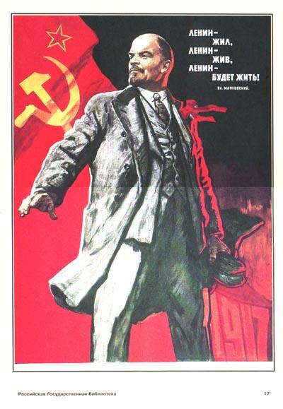
I’m not at all sure why, but I simply adore the Soviet-esque Progressivist styling of the label. Just look at that there boss: pictured from the subservient viewing angle of 40 degrees off center and ten or so down, gazing upward into his craggy, impassive boss-like face as he looks to the future….or quite possibly stares the future down. He looks a bit like Lenin in an early Soviet propanganda poster:
In fact, the very name of the product seems to lend credence to the Soviet propaganda tie-in. “Boss” as in “Party Boss”.
And let us not fail to notice that his steaming cup of Vladivostokian Supremo is being poured for, rather than by him, further driving the point home. This is a man at the top of his game, a leader, a true visionary in his field. As such, he has no time for such frivolities as pouring his own coffee, or even turning his head slightly to tell you to get back to work. He has people for this sort of thing! Do the pipe and suspenders tell you nothing??
The whole effect is very over-the-top, and in that way very Japanese (whose firms’ marketing divisions so often seem to delight in out-Westerning the West). But it is also very perceptive and to the point. The label is not just a hash of words that someone thought would sound pleasing to their customers’ ear. It appears to be a fun little poke at the whole concept of commerce and leadership, and the stereotyped role coffee plays in both. Would that American firms like, oh, say, Wolfgang Puck might pay so much attention to the power of packaging. Or, for that matter, make such a decent cup of coffee.